Designing for
every mind.

I’m a UI/UX Designer bridging the gap between high end aesthetics and radical accessibility. By leveraging neuro inclusive design principles, I build digital products that remove cognitive barriers and prioritise human clarity for every mind. After all design is in the dialogue.

Interface preview of the Neuro Diverse Entrepreneur App

Neuro Diverse Entrepreneur App

Simplifying startup resources for neurodivergent founders.

Interface preview of the AI Teaching product for neuro diverse entrepreneurs

AI Teaching product for neuro diverse entrepreneurs

Helping entrepreneurs build their MVP with AI.

Interface preview of the AI Teaching product for neuro diverse entrepreneurs

AI Learning platform for neuro diverse entrepreneurs

Education fo Neuro Diverse individuals whether they want to start a business or just learn something new.

Poduca – Engineering a Content Ecosystem

Poduca – Engineering a Content Ecosystem

A full scale brand and digital platform build for a London-based podcast production agency specialising in B2B content strategy and revenue driven audio.

Engagement Hub

Employee Engagement Hub – Interactive Prototype

A high-fidelity prototype of a "Single Source of Truth" for employee engagement.

Case Study 01

Neuro Diverse
Entrepreneur App

Redesigning health tracking for Executive Function support.


UX Research UI Design ADHD Focus Dyslexia Focus Autism Focus Claude AI ChatGPT AI Lovable
Detailed view of the Entrepreneur App

Project Overview

NeuroGuides is a mobile application designed to support neurodiverse entrepreneurs, founders, and employees. It aims to provide resources, guidance, and support tailored to their specific needs in starting and running a business. The app will be available on both Android and iOS platforms.
The challenge was to create a system that could process large datasets in real-time while presenting the information in an easily digestible format for non-technical users.

Challenge: Ensuring content relevance, chatbot effectiveness, accessibility, and platform compatibility pose significant hurdles in supporting neurodiverse entrepreneurs, requiring continuous monitoring and adaptation to user feedback and evolving best practices.
Solution: Partnering with experts, using robust NLP, adhering to accessibility guidelines, and employing cross-platform tools can overcome these challenges, necessitating ongoing updates and improvements to maintain app functionality and user satisfaction.


Lessons Learned: Key takeaways include the importance of continuous user feedback in refining app features, the necessity of prioritizing accessibility from the outset to ensure inclusivity, and the value of building strong partnerships with neurodiversity experts to maintain content relevance and accuracy. Additionally, we learned that a phased approach to feature implementation, starting with a minimum viable product (MVP), allows for iterative improvements and better alignment with user needs.
94%

Task Success Rate—achieved by neurodivergent pilots who previously reported 'High Fatigue' using standard enterprise dashboards.

Case Study 02

AI Training product
For neuro diverse entrepreneurs

AI Training Platform is an educational and technical launchpad designed to help entrepreneurs build their initial Minimum Viable Product (MVP) using AI.


UX Research UI Design Figma Claude AI Gemini AI
Detailed view of the Cognitive Load Tracker dashboard

Project Overview

The AI Training Platform is an educational and technical launchpad designed to help entrepreneurs build their initial Minimum Viable Product (MVP) using AI. Recognising that the gap between a business idea and a functional prototype is often a lack of technical expertise, this platform provides a guided, hands-on environment.
It teaches users how to leverage existing AI models, train them on specific niche data, and integrate them into a product without needing a dedicated engineering team.

Performance with Large Datasets

Challenge: Entrepreneurs often bring messy, unstructured data that slows down the training process and causes UI lag during the "learning" phase.
Solution: I implemented asynchronous background processing using Celery and Redis. This allows users to continue their educational modules while the platform cleans and processes their data in the background, preventing the browser from freezing.

Real-time Updates


Challenge: Users need to see how their AI is "learning" in real-time to gain confidence in the MVP they are building.
Solution: I used WebSockets to provide live feedback loops. As the model processes new data points, the UI updates with "Confidence Scores" and progress bars instantly, making the "black box" of AI feel transparent and manageable for the founder.

Lessons Learned


Abstraction is Key: The biggest challenge was deciding how much technical detail to show. I learned that "hiding" the complexity of the code while "highlighting" the logic of the AI helps entrepreneurs move faster.
The Power of Feedback: Real-time visual cues are the most important part of the UX for non-developers; without them, users often feel lost in the process.
AAA

WCAG Compliance this includes compliance for Neuro Diverse conditions such as Autism, ADHD and Autism.

Case Study 03

Neuro Diverse AI Learning
EduTech Platform

Making complex data manipulation feel intuitive and reducing cognitive load.


Figma UX Research UI design ChatGPT AI Claude AI
Detailed view of the Cognitive Load Tracker dashboard

Project Overview

AI training interfaces are notoriously "dense." The primary challenge was to create a workspace that handles large amounts of text and technical parameters (temperature, tokens, system prompts) without overwhelming the user.
Information Hierarchy:A three-column layout (or a collapsible sidebar) to separate global settings from the active workspace. This ensures the "canvas" remains the focal point while keeping controls accessible.
Visual Feedback Systems: * Implemented Progressive Disclosure: Advanced model parameters are tucked away in "Advanced" menus to keep the UI clean for standard tasks.
I designed this specifically for Data Annotators and Prompt Engineers who spend 4+ hours a day in the tool. The dark-mode-first approach was a conscious choice to reduce eye strain during long-form text evaluation.

-22%

Cognitive Friction this is geared more towards the neuro diverse community and can be switched off for regular users.

Case Study 04

Poduca
Engineering a Content Ecosystem

Poduca, a premier London podcast agency. The project involved translating their '10x Content' philosophy into a high-converting B2B website. By focusing on ROI-driven messaging and a clear production-to-profit roadmap, the site empowers Poduca to close high-ticket clients looking to dominate their niche through strategic audio."


B2B Strategy Web Design UX/UI Content Ecosystems Branding Conversion Optimisation Hostinger
Detailed view of the Poduca website

Project Overview

A full scale brand and digital platform build for a London based podcast production agency specialising in B2B content strategy and revenue driven audio.

The Challenge

Most B2B companies view podcasting as a "hobby" or a "brand awareness" play with no clear ROI. Poduca needed a digital presence that positioned them not just as "audio editors," but as growth partners. The challenge was to communicate a complex value proposition: how one hour of recording can be leveraged into weeks of marketing collateral (the "10x Content" strategy).

The Strategy

We focused on a "Value First" user journey. Instead of just listing services, the site was architected to educate the visitor on the Podcast Playbook.
Target Audience: CEOs, Marketing Directors, and Founders.
Key Messaging: "Turn your conversation into your competitive advantage."
Conversion Focus: Moving users from "curiosity" to "choosing a production plan" (Post-Production vs. Growth Engine vs. 360 Content House).

Solutions Delivered

Strategic UI/UX: Designed a clean, authoritative aesthetic (utilising high contrast typography and professional imagery) to build trust with corporate clients.
The "1 Hour = Everything" Visualisation: Created a clear content breakdown showing how 1 hour of conversation becomes social clips, newsletters, and SEO blogs.
Tiered Pricing Architecture: Developed a clear 3-tier pricing structure (£395 to £5,900+) to qualify leads and simplify the sales process.
Content Hub: Integrated a system for strategy blueprints and "Podcast Launch Checklists" to capture lead data.

Results (The "Impact")

Positioning: Successfully shifted Poduca from a service provider to a strategic consultant.
Lead Quality: The structured service tiers reduced "tyre kicker" inquiries by providing transparent pricing and clear deliverables upfront.
Brand Authority: The site now serves as a high converting digital "salesperson" that mirrors the professional quality of their audio production.

Key Features

End to End Workflow Integration: Showcasing the journey from studio recording to guest booking and distribution on Spotify/Apple.

Growth Engine Engine: A section dedicated to repurposing highlighting the "Content Powered Profit System."

Responsive Design: Optimised for mobile, as the target demographic often consumes content on the go.

Case Study 05

Employee Engagement Hub
Interactive Prototype

The Challenge
Organisations often struggle with "engagement fragmentation," where employee benefits, recognition, and internal communications are spread across multiple disconnected platforms.
The Goal: To design and build a high-fidelity prototype of a "Single Source of Truth" for employee engagement.
Constraints: The prototype needed to demonstrate complex data visualisation and navigation logic without a live backend.


HTML5 Figma UX/UI CSS3 (Custom Variables/Flex/Grid) Vanilla JavaScript
Detailed view of the Engagement Hub

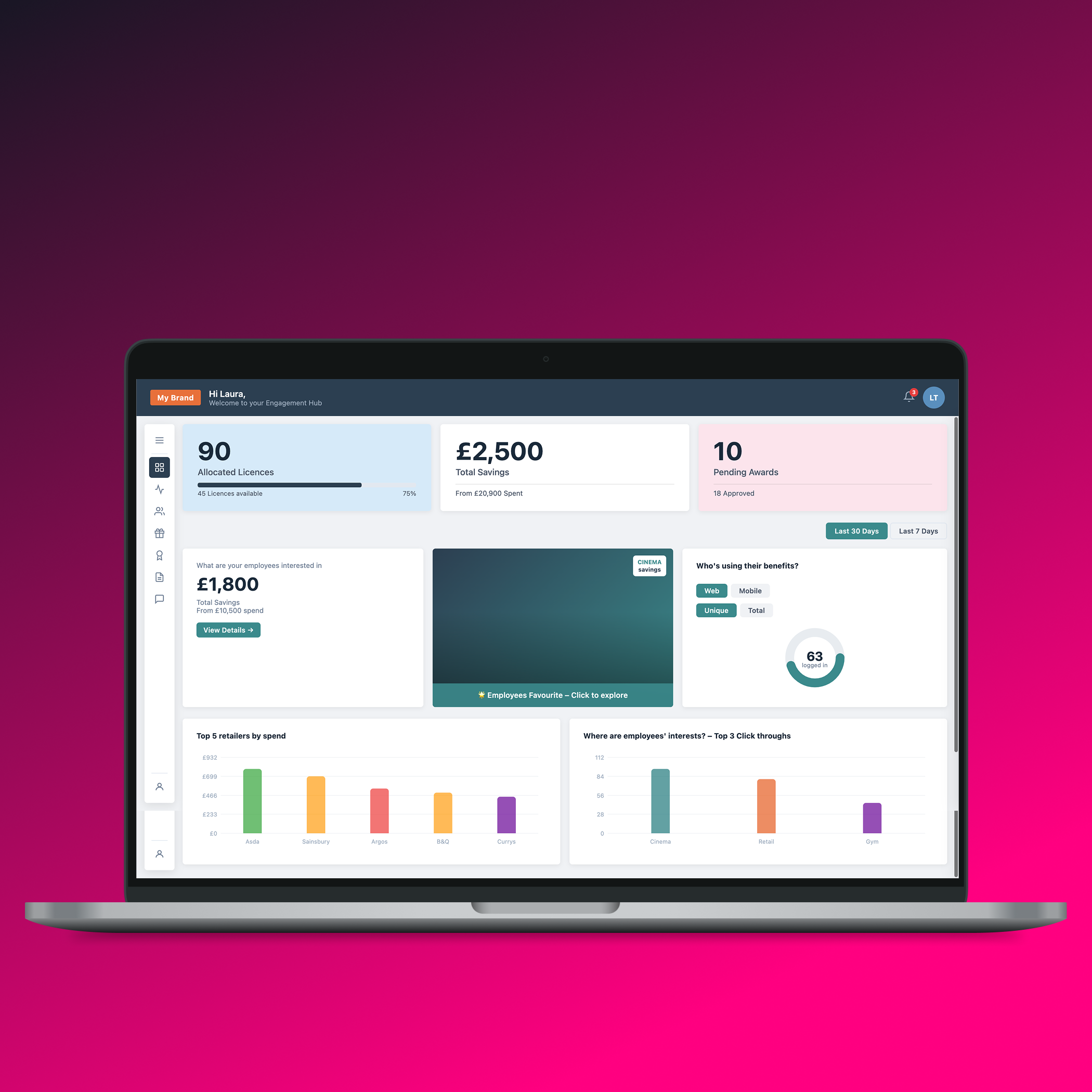
Strategic Solution: The "Modular Hub"

I designed a three-tier navigation system to manage high information density.

Floating Global Sidebar:

A slim, 52px sidebar providing instant access to high-level modules (Analytics, Employees, Benefits, Rewards).

Contextual Flyout Menu:

A 232px interactive flyout that reveals sub navigation for specific tasks, like "Manage Schemes" or "Send Award," reducing cognitive load by keeping the main workspace clear.

Dynamic Content Loading:

Developed a custom SPA (Single Page Application) logic in Vanilla JS to switch between pages (e.g., nav('dashboard'), nav('analytics')) with CSS-driven entry animations for a seamless user experience.

Key Features Developed

Data Visualization Engine: Built custom SVG-based charts and "Donut" progress arcs to represent engagement metrics. I implemented logic to animate these elements based on time-range selections (7 days vs. 30 days).
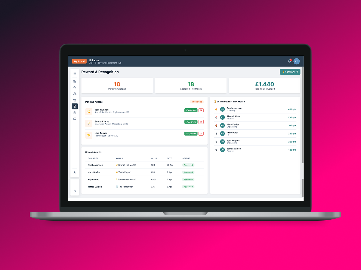
Gamification & Recognition: Designed a "Reward & Recognition" module featuring a peer-to-peer award system and a company leaderboard to foster a positive workplace culture.
Employee Lifecycle Management: Integrated a searchable employee directory and an invite management system with custom-styled form components.
Sentiment Analysis Dashboard: Built a dedicated feedback section that visualizes employee mood through sentiment emojis and percentage metrics.

UX & Design System Highlights

Visual Hierarchy: Used a sophisticated color palette—Navy (#2C3E50) for professional structure and Teal (#3B8A8C) for primary actions—to guide user focus.
Micro-interactions: Developed custom toast notifications for user feedback and "Pill" tags (Green, Red, Orange) to indicate status updates across the platform.
Performance-First Code: Leveraged CSS Custom Variables for consistent branding and Flexbox/Grid for a fully responsive layout that adapts to various viewport sizes.

Lessons Learned

VPrototyping Complexity: This project allowed me to master complex state management in Vanilla JavaScript, simulating a real-world application environment.
User-Centric Navigation: Testing the "Flyout" vs. "Static" sidebar revealed that users preferred the flyout for deep-task focus while maintaining a clear view of their primary dashboard.

NDA-Compliant Note

This prototype was created 3 years ago as a proof-of-concept. To maintain confidentiality, all original branding and sensitive business data have been replaced with "My Brand" placeholders and mock data. The focus of this case study is on the technical architecture and UI/UX methodology.